

Series And Their Covers
A topic that I have begun to wonder about. Is it just me? (Most of the time it is) Or does it bother anyone else?
When an author writes a series, don't you think the covers of the books should resemble the fact that they are in fact...a series? Take for example Laura Lee Guhrke's trilogy...
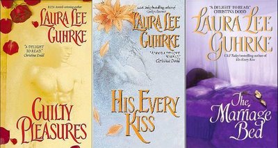
The first two books? Very good! Her name is in the same spot and same font, the flower in the corner goes. The sketched man in front. It all says "Hey we go together, we're a series"! But then the third book....what the heck were they thinking? I know I know I get it, The Marriage Bed...there's a bed on the cover. But it just doesn't go, know what I mean??? The authors name isn't even in the same font for goodness sake! The only think they have going for it is that the title is in the same spot and font. But the rest? Totally off the mark. I would never guess that book went with the other two. Would you???
But now they aren't all bad, some authors get them right. Such as Karen Marie Moning. Look at these covers....they scream "Buy me together I'm a set." (okay enough with my 'screaming', I'm annoying myself) But you get my point, right! The font is all the same, titles in the same spot, authors name in the same spot. You get just a glimpse of the hero in each cover, but only a teasing amount. Same back drop color....I can go on and on about these covers.

I know I've been labeled a cover snob (Holly) and I don't deny it. But really am I the only one this bothers??? Or if not bothers at least you notice it???? Come on tell me I'm not losing it here.
Labels: Other Goodies
Posted by Rowena at 5:46 PM::
![]()
![]()
---------------------------------------------


0 Comments:
Post a Comment
<< Home